
Slides And Visuals For Your Pitch

Slides in a presentation are like seasoning on a meal - they add their own flavour, and bring out the best in what you’ve made.
They can also completely ruin the dish, and the seasonings that work in one setting might be distasteful in another.
Good seasoning is why restaurant food tastes better than what you might cook at home, and good slides give the aura of professionalism and legitimacy.
Good slides and visuals improve your pitch, but bad slides are worse than not having slides at all.
The moment the audience sees a crappy slide, they instantly form an opinion and start tuning you out.
At least with a story, it takes a while to work out how credible your claims might be.
The ranking goes:
1. Good slides and a good talk
2. No slides and a good talk
3. Average slides and an average talk
4. No slides and an average talk
5. Bad slides
Good visuals bring the best out of a good idea; and can jazz up an average one.
But if you don’t want to take them seriously, you’re better off without them.

If slides are like seasoning, then demonstrations like videos or prototypes are like a flambé:
if you know what you’re doing, it’s a dazzling moment, but if you don’t, you’ll set the kitchen on fire.
E.g. the internet drops out, sound doesn’t connect, or your prototype breaks.
It will unnerve you, it unsettles your audience, and the failure will be the main thing people remember, not the quality of your business.
If you’re keen to use a video or demonstration, it will require some practice, backups, and a reassuring calmness if it doesn’t go to plan.
How Many Slides Should We Prepare?
The actual rule here would be “as many as you need to tell an interesting and compelling story”.
Since that answer is unhelpful, we’d suggest a maximum of 1 slide per 45-60 seconds.
So that might mean:
An elevator pitch might just be your name and strap line
3 mins: title, problem, solution
5 mins: title, customers/problem, solution, reactions/validation, ask and contact
10 mins: title, problem, customer, knife turn, solution, customer example, validation, business model, numbers/metrics, next steps
You might choose to have 2 or 3 slides for some of those points, like flicking through a few customer quotes or a few different product shots, but the ratio and pace of your presentation remains the same.
Finding And Using Templates
If you’re not a designer or you don’t have a style guide with a specific structure, then you’re going to want to find examples of other presentations that you like, and make them your own.
Remember Marten Ascenzo’s rule: good taste can come from copying good taste.
Realistically, the two best places for a crafty entrepreneur to use are Canva and Unsplash.
Canva has excellent templates, many of which are free to use, and these have been proven to work elsewhere.
You can pick one that you think would convey and enhance your brand’s message, then replace each image/quote/text box with one of your own.
Controversially, please don’t use the default Microsoft PowerPoint templates – they are liable to cause trouble and worst of all – are often ugly.
PowerPoint is great, the default designs are not.
For photos that you haven’t taken yourself, try a range of royalty-free image sites and see what keywords produce relevant and compelling pictures.
Unsplash is the current leader, but there are many other sites, each with their own strengths.
Unsplash is great because its range and its high benchmarks for image quality – no clip art or plain photography.
It is also constantly updated, so it’s worth filtering through a wide range of key word searches when hunting for imagery.
Some Guidelines For Setting Up Text On Slides
While there are good exceptions to every rule, these suggestions are applicable in 95% of circumstances:
You should use 1-2 fonts at most, otherwise it becomes jarring
No more than 30 words per slide, unless it’s a brilliant quote
The minimum font size is 24-30, if that fills up the screen then it’s time to split into two slides
If it’s not shared through your device, you’ll need common typefaces or else the system will convert it for you, and you might not like what it chooses
People love to read ahead, and when they do they stop listening to your words
If reading ahead becomes an issue, you can use simple animations (no fly ins or novelty transitions)

This slide could be for anything and says nothing, making it the wrong choice.
Our Pet Hates
At the risk of sounding elitist, there are some tell-tale signs that someone does not know what they are doing.
That might be because this is their first presentation, or their first since 1999, or that they’ve thrown the presentation together in a hurry.
The following are guaranteed not to help your message:
Clip art, like what you find on default Windows applications
Emojis, they never convey what you hope they’ll convey
Differing sizes images, it looks like a kid’s collage
Spelling mistakes
Stretched images
QR codes, controversial but they become an awkward distraction for your audience.
Extra Slides
Keep extra slides at the back for any Q&A, particularly any graphs, charts, quotes or photos.
You can easily jump to them when in presenter mode, supporting your responses to whatever questions you’re asked.
Entrepreneurs don’t like deleting slides from a presentation – it’s like they’ve been asked to delete their family photo albums – but relegating slides to the back is much easier.
Worked Examples
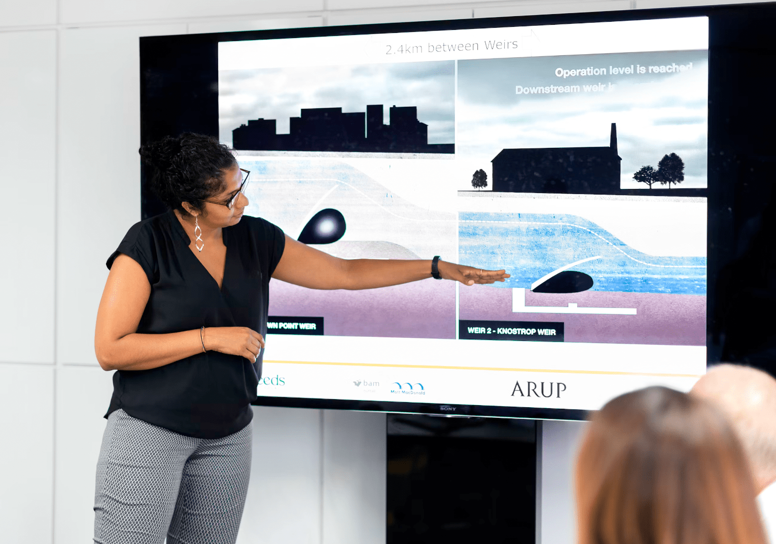
You can find plenty of examples of the world’s best slides, built for big companies by expensive designers.
While they are beautiful, they are harder to learn from.
Here are some fictional startups designed by students – we improved these drafts ahead of their showcase day, but they are a good mix that highlight all of the rules we’ve outlined above…

While the wordmark isn’t great, that’s a 10/10 product mockup

This is a brilliant cover slide, perfect for their startup

Unfortunately it was followed by this slide, featuring several pet hates, particularly the generic clip art
This is a good slide, the text is a bit small but it’s eye catching and makes a point
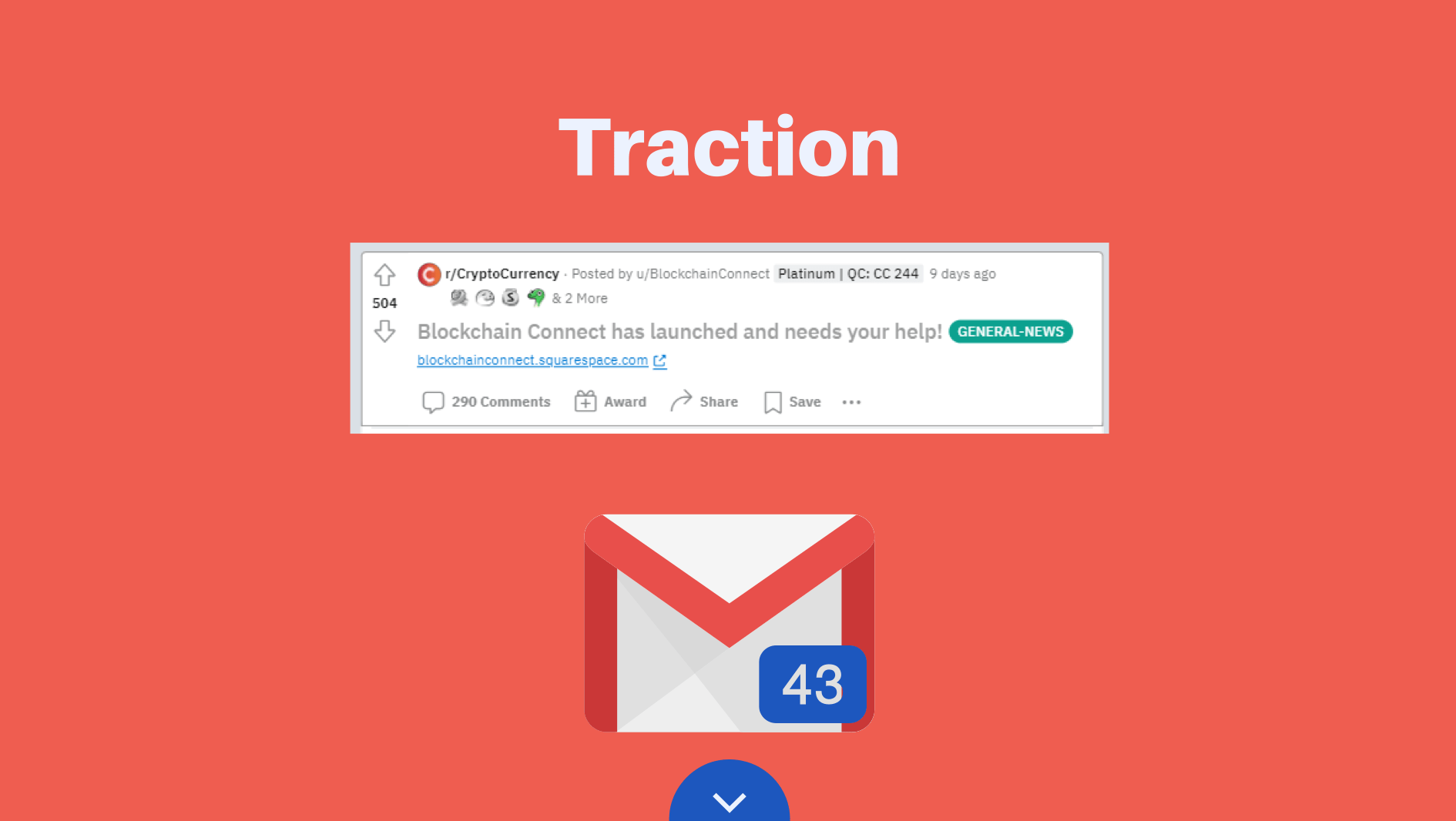
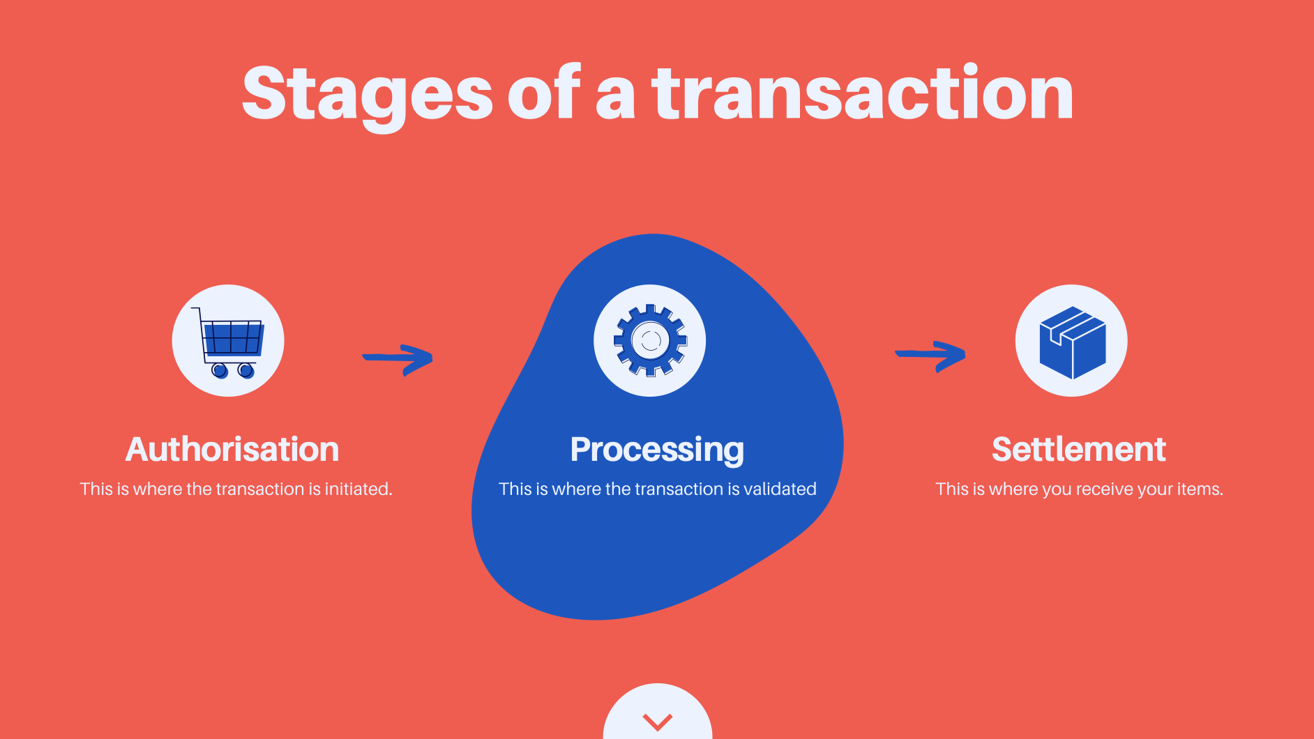
A great slide for telling traction stories, here with examples of community interest and customer conversations

This is a good cover slide, it’s simple and professional

From the above, this is a great use of illustration and statistics, without being cluttered
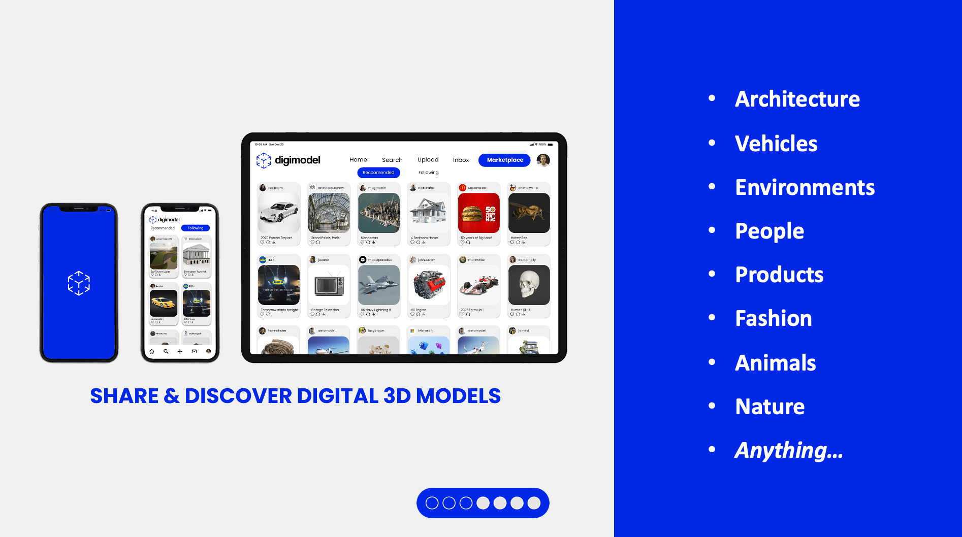
You’d probably change the typeface on the right, but this is a brilliant mockup for a platform/app

Unfortunately this is an example of what the default PowerPoint templates will do to your work - so many elements, none of them compelling

By contrast, this is a beautiful product mockup for a new cosmetic brand

Each element looks nice, but there’s way too much here. We don’t need to educate the audience on customer journey mapping, and could probably cut two of the four photos.

An impressive slide, there’s a lot of little details but they create the desired effect
Realistic Expectations
Remember this general principle – each time you practice your presentation and visuals, your coach or friends can improve it by 1/10.
If you do three rounds of revisions, that’s 3/10, a realistic and achievable improvement in a short space of time.
If visuals are stressing you out, it’s time to send them to a trusted advisor, do something else, and come back refreshed and ready to make them stronger.